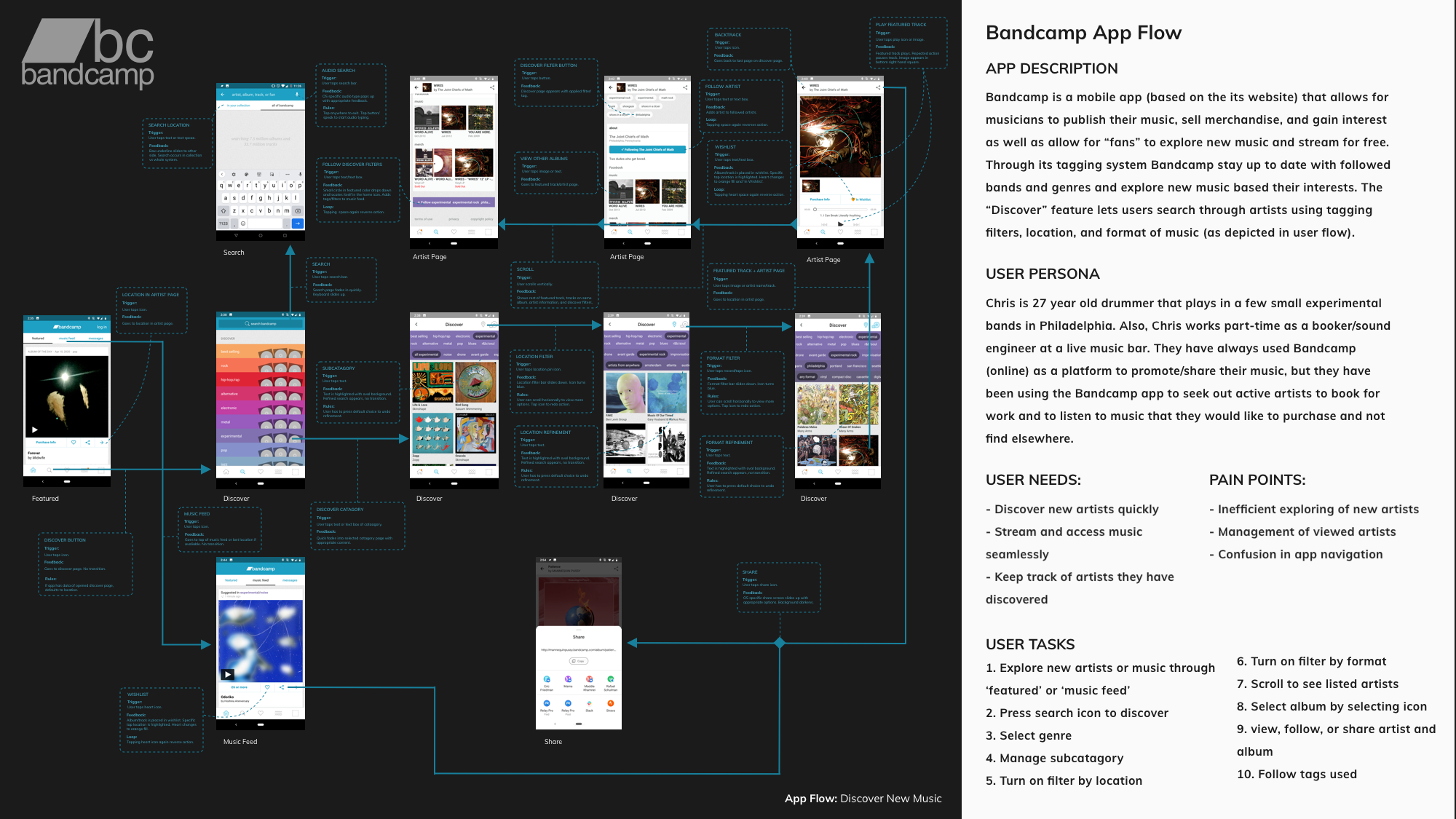
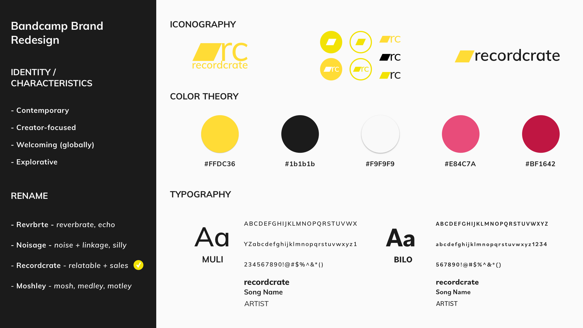
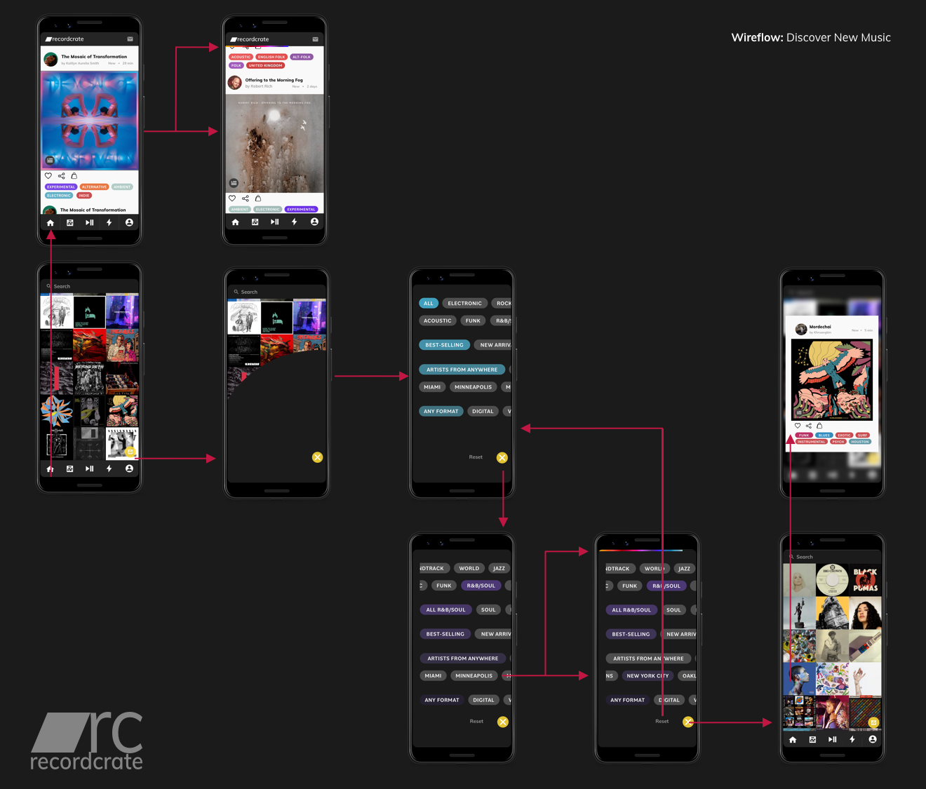
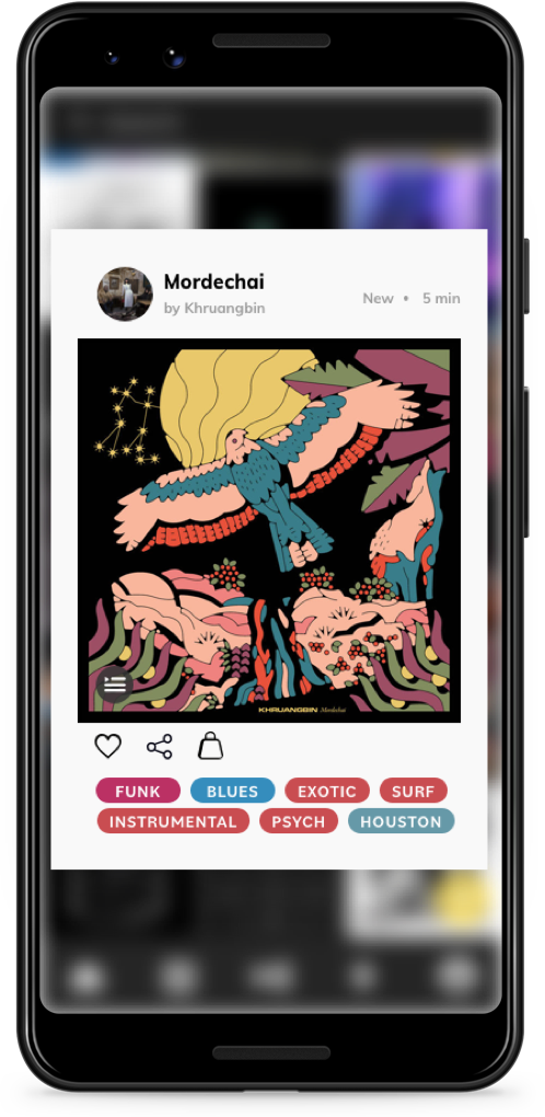
Home

Development

UX/UI Design

Art

About

Recordcrate: A Bandcamp App Redesign
Recordcrate is a suggested app and brand redesign of Bandcamp, a platform for musicians and audio-creators to publish, promote, and sell their work.
Synopsis

Recordcrate is a prototype of suggested solutions to the observed issues of Bandcamp's current mobile app. This case study consists of a full interface analysis (user persona, user needs, user tasks/interactions and their trigger/feedback/rules/modes, user flow, and pain points), a rebrand, and prototypes of suggested interactions/new interface.

User Flow
Rebrand

When rebranding Bandcamp to Recordcrate, I wanted to emphasize the inclusive nature of Bandcamp's brand and the app's streaming + merchandising services.

Wireflow
Music Feed

For the music feed, I created a system that would allow for the user to intuitively see what has been newly released by artists or newly suggested for them. The music feed also connects to the filtering system, showing what tags the album has so they can easily find more like it.

Discover page/Filtering System

The filtering system was designed to easily refine searching using a scrollable and nesting catagories/subcatagories, the signature rainbow progress bar, and a gradient, color-coated system based on possible genres. This coordinates with the tagging system featured on the music feed. The animation of the stickers/tags and the album layout is inspired by the analog experience of shopping for records.

Album Preview

This interaction demonstrates how the user would hold down on the album cover to preview the album on the discover page, which would autoplay the featured song selected by the artist. This allows for the user to quickly find new music based on their selected filters.