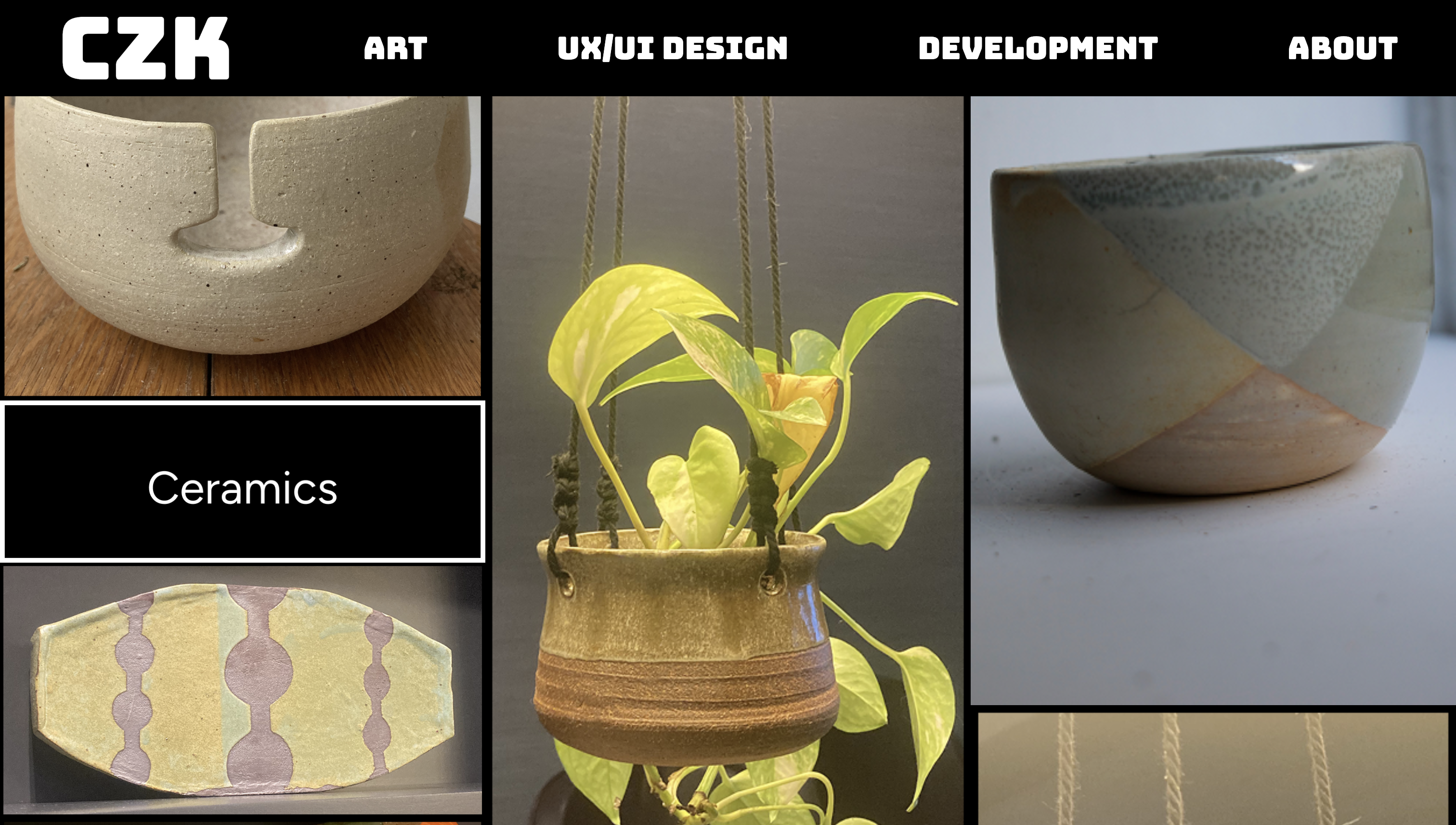
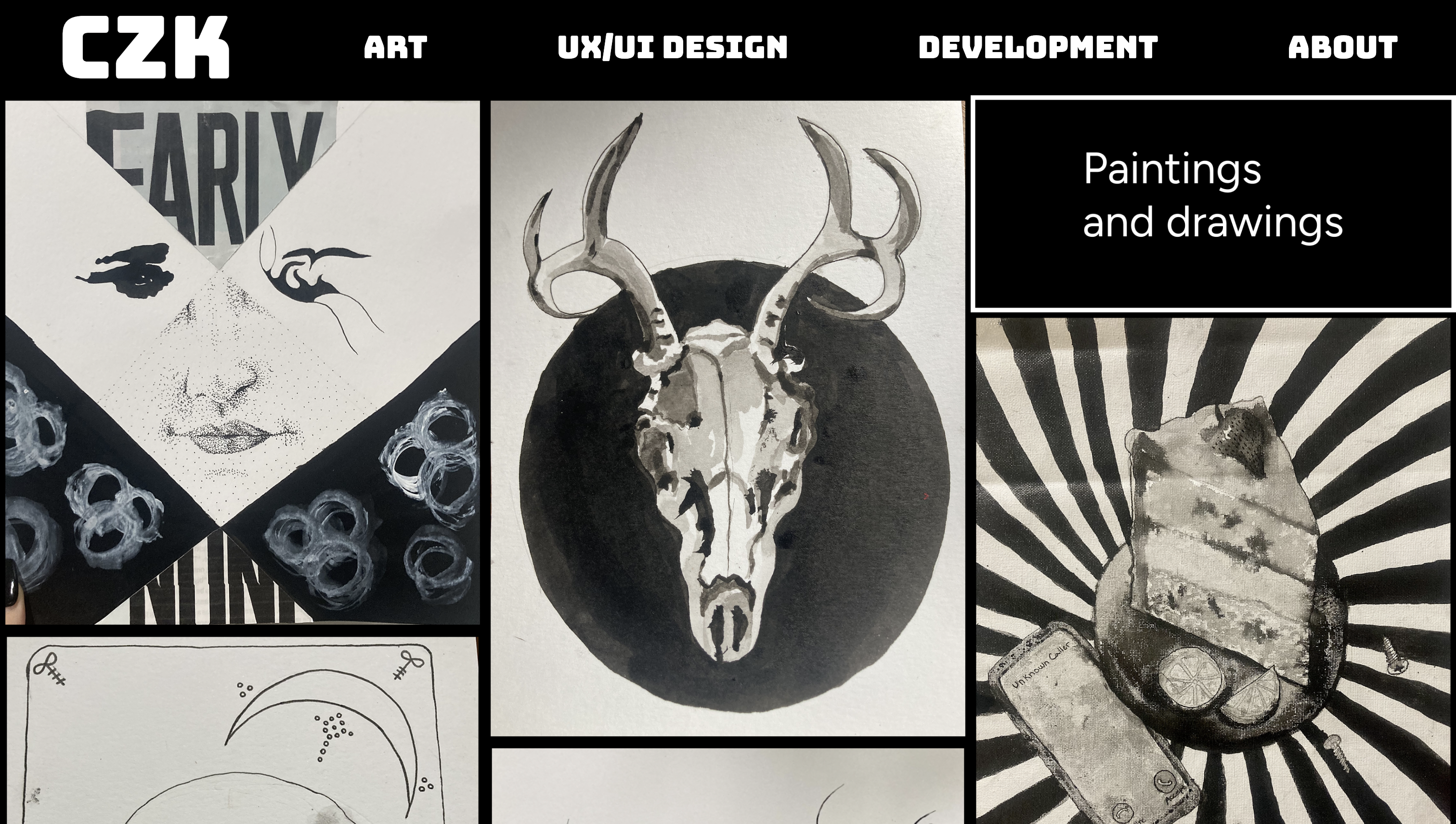
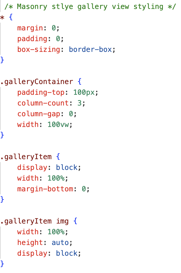
It was a joy to work on this personal project. Having made multiple portfolios in the past, I decided to scrap what I had and start fresh. I showcased my design and development skills while creating space for my other artforms. View the whole repository here.
While creating my personal website, I wanted to show my work with a clear, bold design. While picking the fonts I wanted a signature font that has a vintage element and a square dimension. To accompany this bold font, I chose a friendly, readable font for the body of the pages/case studies.
When designing the gallery view in Figma, I had a clear vision of how I would transcribe the design to HTML/CSS. Though when coding the masonry style grid, I couldn't seem to remove the gaps between the rows. Finally, I was able to create a masonry grid that is slightly more rigid than my orginal design but highly functional and applicable to all the art pages. Displayed is a sample of the CSS file that controls the gallery view.
The modal was an essential feature to have for the gallery pages of the website. The goal was to have a description available for each image. Using an event listener for each image, I created a function in JS to show the modal with the image on click. The description shown is based on the alt attribute of each image.
For the case studies, I considered how to organize different types of media to tell a story of each project. Not wanting to overwhelm the reader with too much writing, I wrote concise passages to let the images/videos/pdfs sing on their own. I streamlined the layout for case studies so just one simple CSS file could be applied to each case-study page.